More Than Just a Label.
A great craft beer label does more than identify what’s inside the can. It tells a story, establishes a personality, and gives someone a reason to take a closer look.
Walk through the beer aisle of almost any bottle shop and you’ll find an extraordinary range of visual styles. Some breweries favor bold typography and minimalist compositions. Others embrace elaborate illustrations, unconventional imagery, or nostalgic design.
With so much variety competing for attention, creating a memorable beer label requires more than simply making something attractive. I believe the most successful designs balance illustration, typography, shelf visibility, and brand identity.
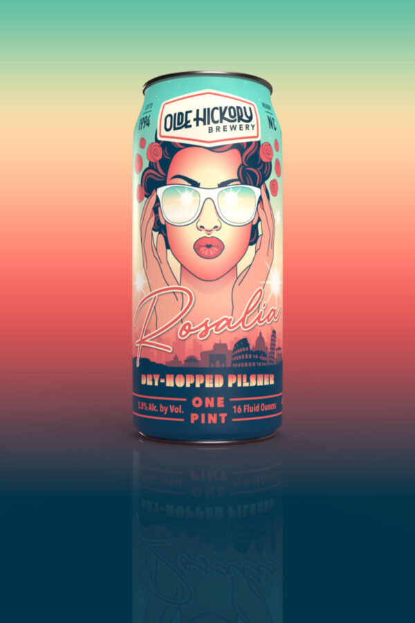
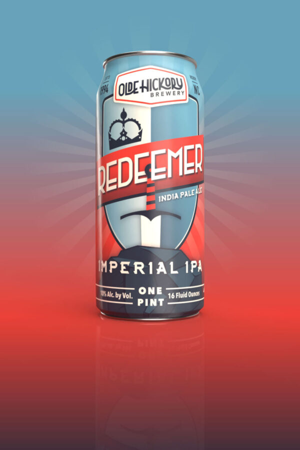
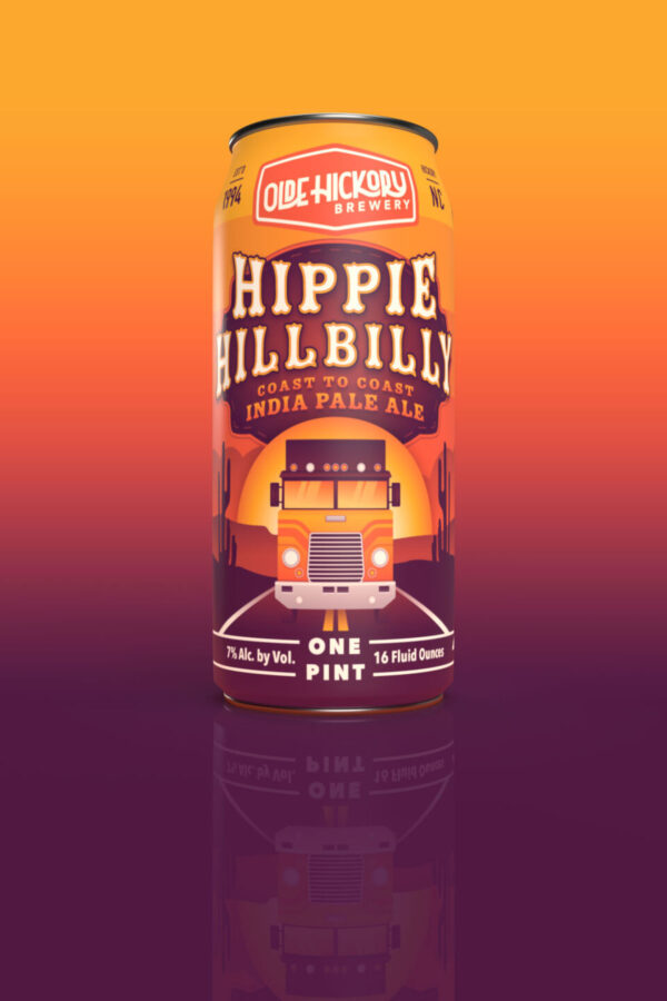
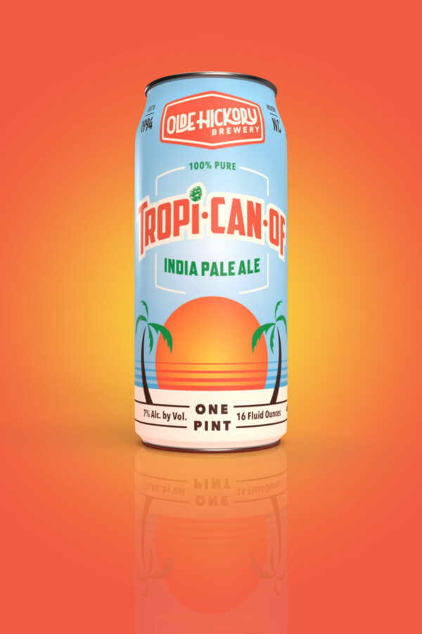
1. Illustration: Giving a Beer Its Personality
Finding the Story
When I’m developing artwork for a beer label, I’m thinking about more than how to make the can look attractive. I’m considering the personality of the beer, the story behind its name, and how those ideas might translate into something visually compelling.
Creating Something Original
One of my favorite things about craft beer design is the freedom to explore unusual concepts. Original illustration allows a brewery to create something uniquely its own, whether that’s an elaborate narrative, an unexpected character, or a simple but memorable visual idea.
Making It Meaningful
Not every beer needs an elaborate illustration. Sometimes a restrained approach communicates more effectively than something highly detailed. What matters is that the artwork feels intentional, connects with the beer’s identity, and gives customers something worth remembering.
2. Typography: Making the Right Impression
Establishing Character
Typography communicates personality before someone reads a single word. Traditional lettering can suggest heritage and craftsmanship, while bold contemporary type can feel confident and energetic. Choosing the right typography is as much about establishing the beer’s character as it is about readability.
Creating Hierarchy
A beer label contains a surprising amount of information, but not everything deserves equal attention. I try to establish a clear hierarchy that guides the eye naturally, allowing the beer name, brewery identity, and supporting details to work together rather than compete.
Balancing Form and Function
Great typography should complement the illustration without getting lost in it. A beautifully rendered beer name accomplishes little if customers struggle to read it. The challenge is finding that balance between expressive lettering and clear, practical communication.
3. Shelf Visibility: Designing for the Real World
Standing Out
A beer label might look beautiful on a computer screen but disappear on a crowded retail shelf. With so many competing designs, strong contrast, thoughtful color choices, and a recognizable focal point can make the difference between being noticed and overlooked.
Thinking Three-Dimensionally
A beer can isn’t a flat canvas. Its curved surface means customers only see part of the artwork at any given moment. I consider how the composition wraps around the container and which elements need to remain visible from the front.
Designing at Actual Size
It’s easy to become absorbed in details when working on an enlarged design. I find it important to consider how the finished artwork will appear at its actual printed size. A successful label should communicate something compelling from a distance and reward closer inspection.
4. Brand Identity: Building Recognition Across Releases
Establishing Consistency
Every beer deserves its own personality, but individual releases should still feel connected to the brewery behind them. Consistent typography, logo placement, illustration styles, or recurring visual elements can create a recognizable identity without making every label look identical.
Allowing Creative Freedom
One of the challenges I enjoy is finding ways to give different beers distinct visual identities while maintaining a connection between them. A cohesive brand doesn’t have to mean rigid design rules. Sometimes the consistency comes from the overall artistic approach rather than a repeated layout.
Building Familiarity
When customers recognize a brewery’s packaging, individual releases begin contributing to a larger identity. Someone who enjoyed one beer may be more inclined to explore another. Thoughtful visual consistency helps build that familiarity while allowing each new release to offer something unexpected.
5. Bringing It All Together
Designing With Intention
The most memorable beer labels aren’t necessarily the loudest or most elaborate. They’re the ones where every element feels purposeful. Illustration, typography, composition, and branding should support one another, creating a design that feels cohesive rather than a collection of competing ideas.
Finding the Right Balance
There’s no universal formula for great craft beer packaging. A minimalist design can be just as compelling as an intricate illustration. The challenge is understanding the personality of the beer and finding the visual approach that communicates it most effectively.
Making a Lasting Impression
Ultimately, I think a great beer label should accomplish two things: make someone want to pick up the can and help them remember who made it. When a design succeeds at both, it becomes more than packaging. It becomes part of the experience.
Craft Beer Label Design at Reverie Media
At Reverie Media, I create custom beer label artwork and packaging design for independent breweries, including my ongoing work with Olde Hickory Brewery in Hickory, North Carolina.
My approach combines original illustration, thoughtful typography, and distinctive visual concepts to create labels that give individual beers their own identities while supporting the brewery’s larger brand.